
MONCH: Designing a Zero-Text Food Ordering Kiosk
UX Research • UX Design • Accessibility • Kiosk Interface
Role: UX Designer (Interaction Design & Accessibility)
Team: Andrew Li, Kendra Wu, Young Na
Methods: Inclusive design, wireframing, usability testing, iterative prototyping
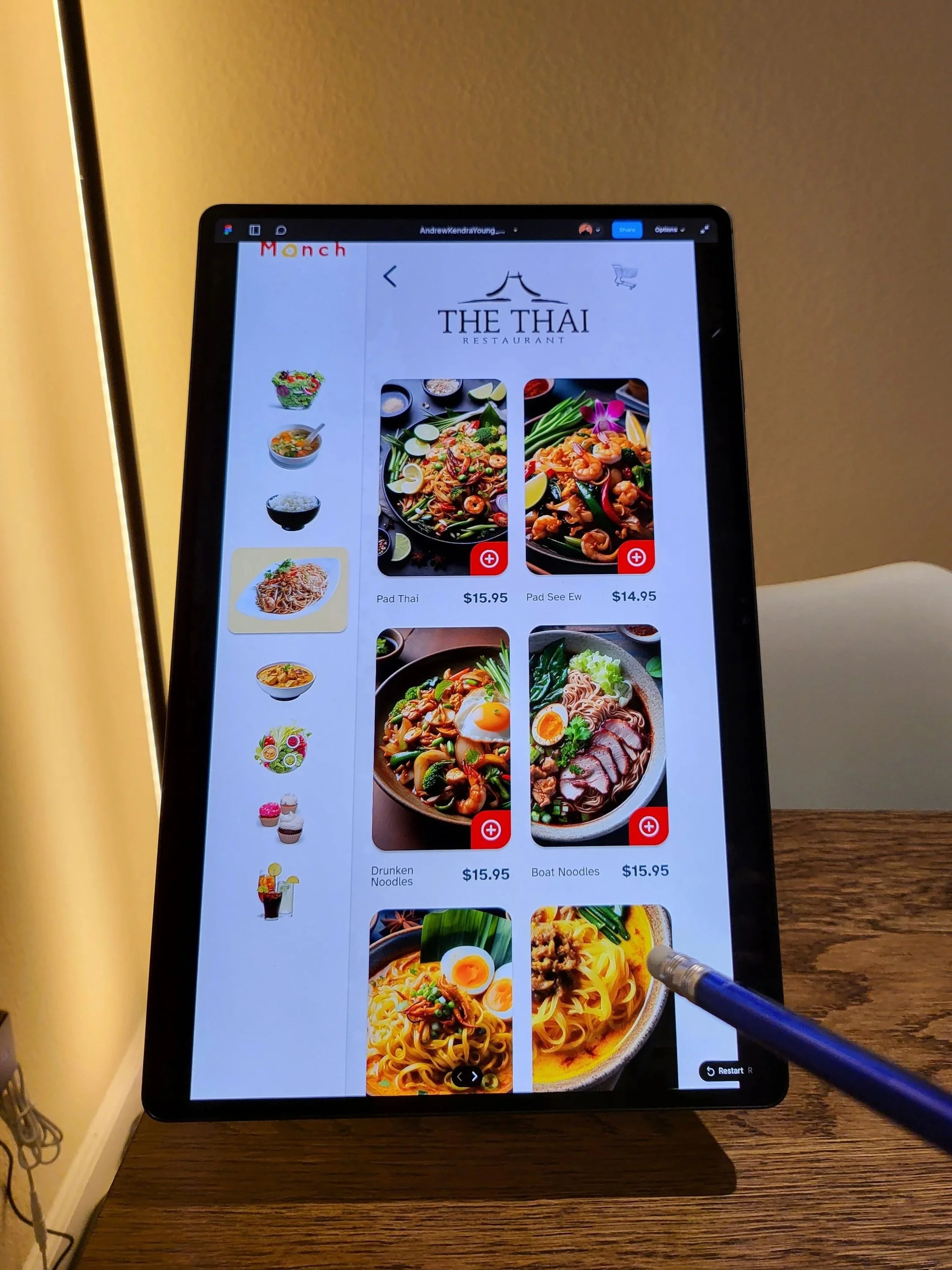
Platform: Food-court kiosk
The Problem
Text-heavy food ordering kiosks create barriers for:
People with dyslexia
Non-native English speakers
Users ordering under time pressure in public spaces
In food courts, these barriers are amplified by long lines, social pressure, and unfamiliar menus, often resulting in stress, ordering errors, or abandonment.


Project Framing
Rather than improving readability through better text, we framed this project around a more radical question:
“What if a food ordering kiosk could be used with little to no text at all?”
This framing shifted the design challenge from translation and typography to visual communication, icon comprehension, and interaction flow. The goal was not to eliminate language entirely, but to reduce reliance on reading as the primary mode of interaction — especially in fast-paced, public environments
My Role
On a three-person team, I contributed to:
Framing the accessibility problem and target users
Designing interaction flows and information architecture
Conducting and synthesizing usability testing
Iterating on the interface based on test findings
Design Principles
Minimize reliance on reading by prioritizing visual cues over text.
We used:
Food imagery as the primary navigation cue
Skeuomorphic icons to reduce interpretation effort
A simple, linear flow to support quick decision-making
The main challenge was ensuring icons were understandable across language and cultural contexts.
Iteration & Testing
Usability testing the prototype
We tested early prototypes to see whether users could:
Select a restaurant
Choose items
Complete an order with minimal text.
Testing revealed confusion around some icons and feedback states, which led us to simplify navigation, clarify visual hierarchy, and strengthen interaction feedback without adding explanatory text.
Outcome & Takeaways
Demonstrated how zero-text interaction can improve accessibility beyond translation
Showed the importance of visual clarity under pressure
Reinforced that accessibility-driven constraints often lead to clearer interfaces for everyone